.png)
Case Study
One year after launch, the Elephaid Foundation mobile app successfully attracted users and maintained strong engagement with its educational content. However, despite this engagement, the app struggled to convert users into donors. Internal analytics and user research revealed a critical gap: while users were interested in the mission, they were unable, or unwilling, to complete the donation process due to usability issues. This project focused on optimizing the overall mobile experience, with particular attention given to improving the Donation flow and reducing friction in key user actions such as donating and signing up to volunteer.
Target increase in volunteer sign-up completion
Target reduction in user drop-off
30% target reduction in donation-flow errors
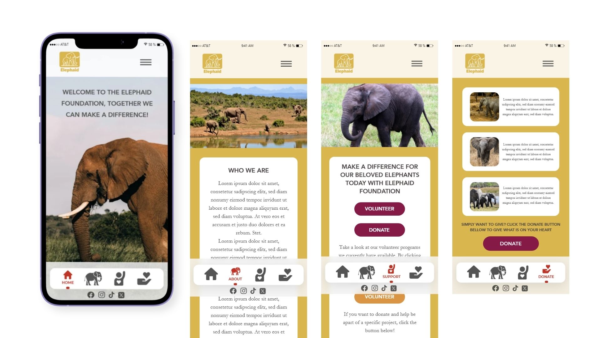
The Elephaid Foundation app was effective at raising awareness but failed at driving action. Users encountered friction when attempting to donate or volunteer, often abandoning the process before completion. Core usability issues included confusing navigation, unclear calls to action, and poor readability across key screens. The Donation page, in particular, contained critical functionality problems that prevented users from completing transactions smoothly. The central challenge became how to transform a content-heavy, awareness-driven experience into one that clearly guides users toward meaningful actions like donating and volunteering, while maintaining emotional engagement with the mission.
The redesign operated within several important constraints that shaped the final outcome. The existing brand identity, including the gold and maroon color palette, needed to remain consistent to preserve recognition and trust.
Typography choices were already established and had to be maintained throughout the redesign. The app required a persistent bottom navigation bar, limiting layout flexibility but ensuring consistency across screens.
Content structure was relatively fixed, relying heavily on imagery and short descriptive text rather than dynamic or long-form content. The entire experience also needed to remain mobile-first, optimized for intuitive, on-the-go interactions.
User research showed that while users connected with the mission, they struggled to take action. Navigation was unclear, CTAs like “Give” were vague, and low contrast text affected readability. These issues created friction and led to drop-offs during donation and sign-up flows. Best practices from organizations like World Wildlife Fund reinforced the importance of clarity, emotion, and strong CTAs.
This project reframed the app from a content platform into a conversion-focused product, targeting key drop-off points in the donation funnel
The redesign focused on three goals: help users quickly understand the mission, create an emotional connection, and make it easy to take action. The experience was reframed to prioritize clarity, engagement, and conversion over passive browsing.
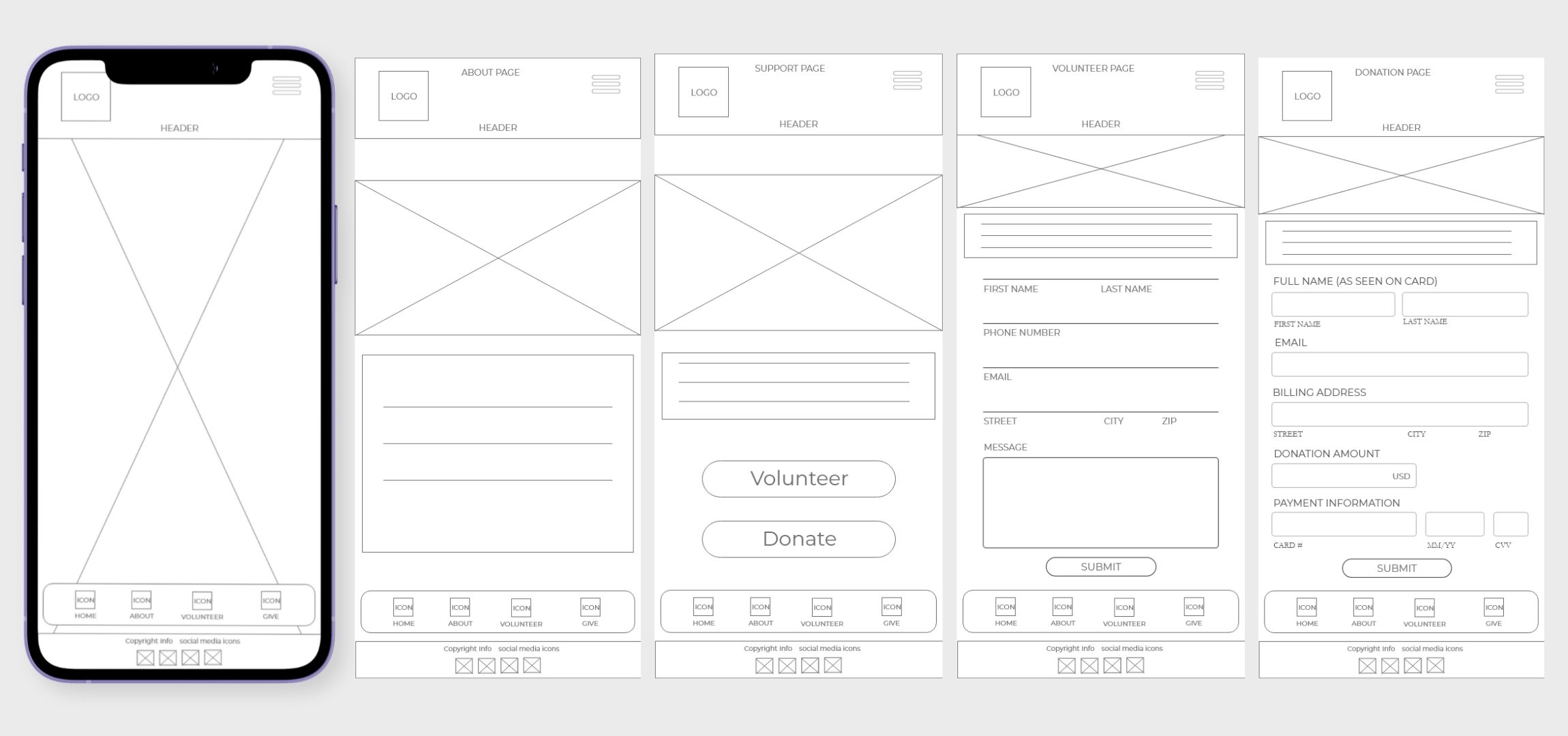
The structure was reorganized to guide users from mission awareness to action, starting with a strong entry point followed by scannable content and clear calls to action.
Decision: Prioritize a top-down flow that leads users directly from understanding the mission to taking action.
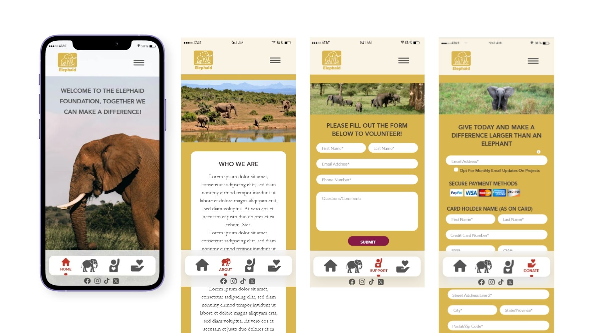
Vague buttons like “Give” were replaced with direct, action-oriented labels such as “Donate” and “Volunteer,” improving clarity and intent.
Decision: Use explicit, high-visibility CTAs to remove ambiguity and increase conversion.
Navigation was streamlined with a clear bottom bar, and content was organized into a card-based layout for easier scanning and usability.
Decision: Reduce cognitive load by simplifying navigation and breaking content into familiar, digestible patterns.
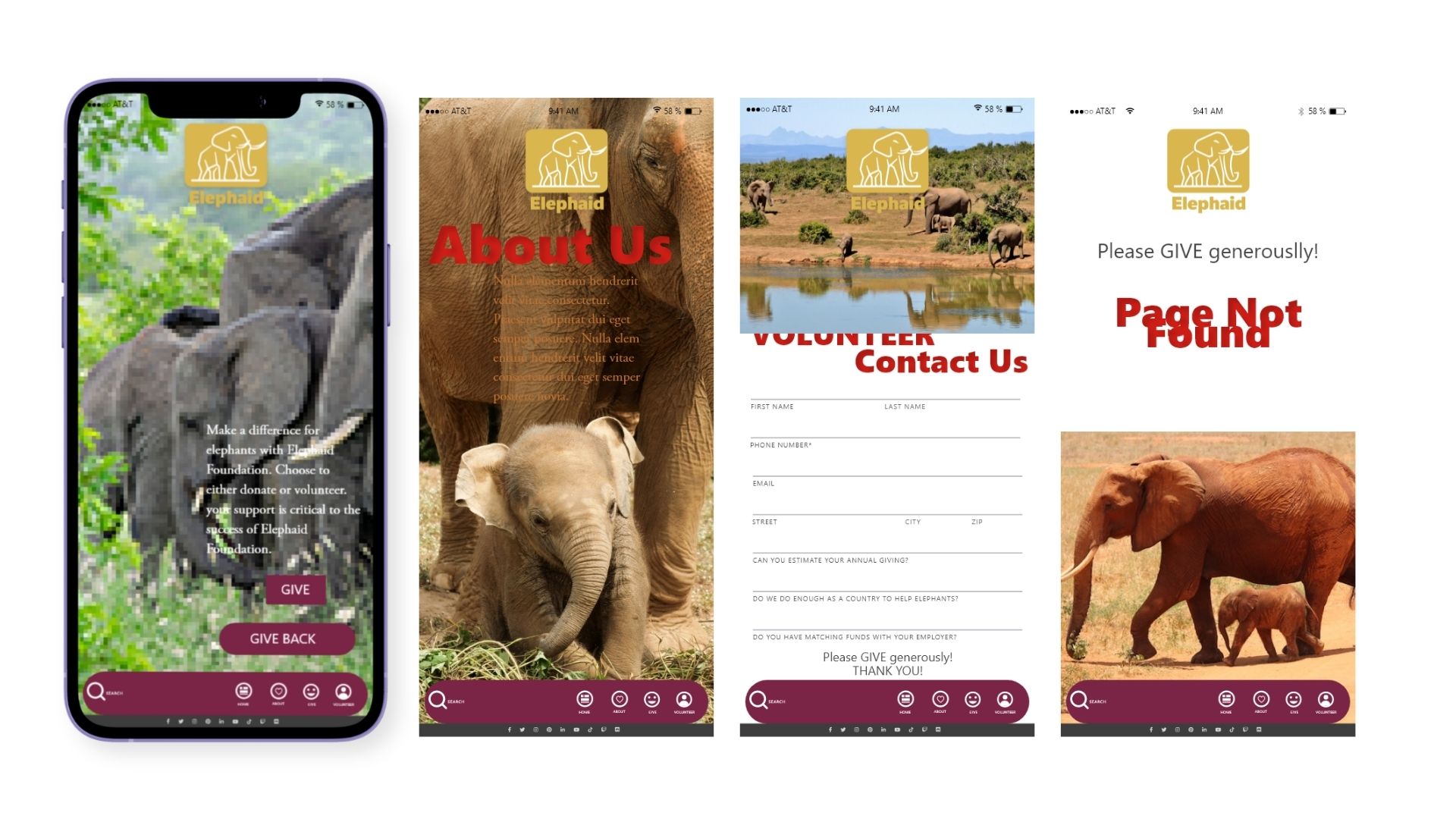
Before, the app lacked clear direction. Navigation was confusing, CTAs were unclear, and readability issues made it difficult to engage or complete actions.
After, the experience is streamlined and action-driven. Users can quickly understand the mission, navigate easily, and take clear next steps. Strong visuals and improved hierarchy create a more engaging and conversion-focused experience.
The redesign focuses on reducing friction in the donation funnel, this has been completed by clarifying calls to action and simplifying navigation, targeting a 20–35% increase in completion rates and a 25% decrease in user drop-off.
Next steps include usability testing to validate improvements, optimizing performance across devices, and introducing features like donation tracking and personalized engagement. Regular content updates will help maintain user interest and long-term support.